If you’ve been part of any wedding planning before, you know that one of the most important decisions is choosing the color palette. Your wedding colors set the central theme for your entire day! From your invitations to bridesmaids’ dresses and venue decor, your color palette is what brings together all of the elements of your wedding. Sound intimidating? Don’t worry, because today I am sharing a step-by-step guide to help you build your perfect wedding palette!
And, be sure to read to the end of this blog post to see a sneak peek of the actual color palette I’ve chosen for my own wedding!

Step One: The Main Event!
To start, you will need the main color that is going to guide the rest of your color palette. This central color is going to be featured heavily throughout the wedding, so many brides choose their favorite color. Alternatively, you can choose a color that you feel best represents the style and theme of your wedding. For this main color, be sure to choose something that you will love to see all around you on your special day.
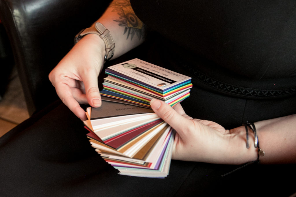
Second, choose a secondary color!
Now that you’ve chosen the main hue of your color palette, it’s time to add a secondary color. Your secondary color should be complementary to your main color. Typically, this means that your main and secondary colors should be the same shade (that is, how dark or light they are). This will ensure that your colors complement each other beautifully and helps to build a cohesive color palette.
If you’re not sure which color to choose, here’s an insider tip: I love when my clients choose their partner’s favorite color as their secondary color! By doing this, your wedding color palette will be a beautiful blend of both people. This is such a sweet way to subtly acknowledge your union with your partner!

Step three: Head into neutral territory!
Don’t forget about neutrals! While neutrals may not be as bold and fun as your main and secondary colors, they are still integral to your wedding color palette. Typically, white (or ivory/cream) is assumed to be part of your palette — You can “officially” add these colors if you want to focus on a light, airy style for your palette. But otherwise, you can just add white hues throughout your decor as needed!
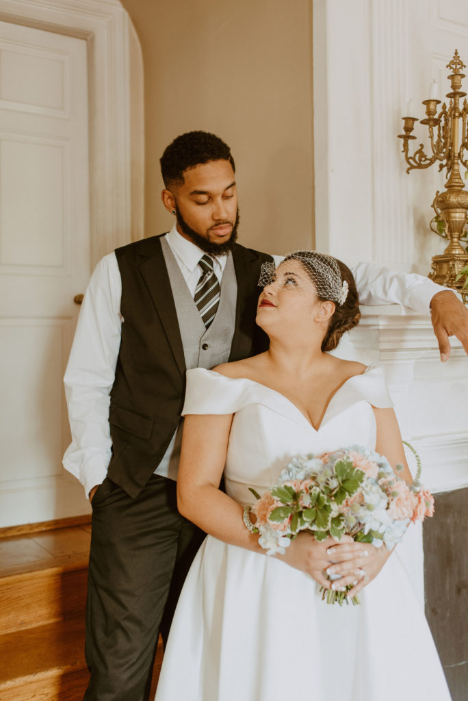
Choosing specific neutrals can be important for other elements of your big day. For example, you will want to choose a neutral color for your groomsmen to wear. Black, charcoal, and navy all make great base neutrals for this purpose!
Photo: MFields Photography
Finally, add an accent color!
Adding an accent color is so important! Using a single color for all of the small details throughout your wedding will make everything feel even more cohesive and harmonious. For this fourth color, you can use something that will highlight and complement your main and secondary colors. Or, you can opt for a trendy metallic shade! Whichever you choose, this accent color will be featured in details of stationery, outfits, table settings, and more. In the end, this “little” color will have a big impact on your palette!
Trend Alert! Monochrome wedding palettes are a huge trend right now.
Monochrome color palettes are palettes that focus on multiple shades of a single color. This trend has become very popular in recent years! Choosing this style for your wedding allows you to play with a bright color while maintaining a clean, classic look. Monochrome palettes can even be used to create a watercolor effect!
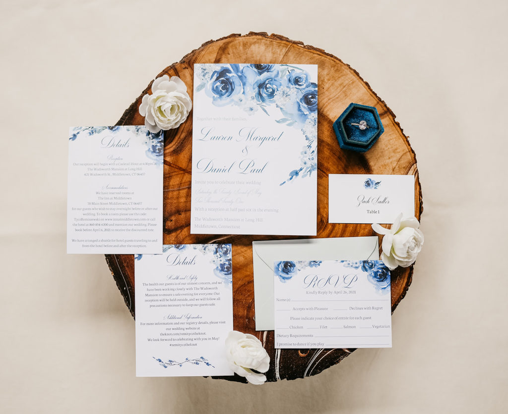
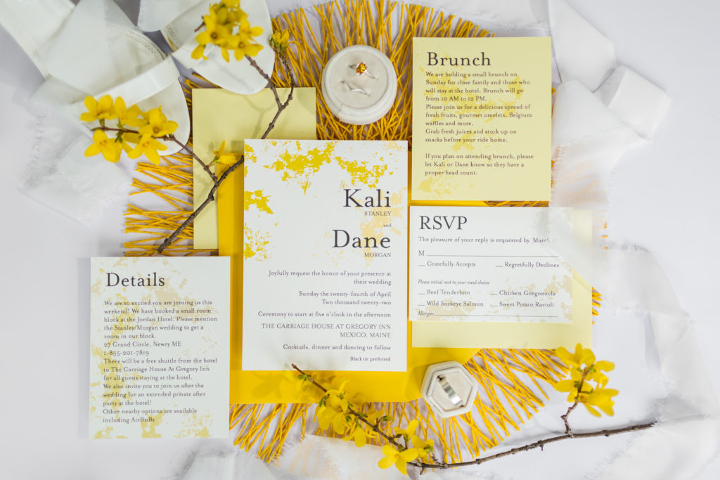
Even if you choose a monochrome palette, all of the other steps above remain true! Choose the main shade, complemented by secondary and accent shades of the same color, add a neutral, and you’ve built a perfect monochrome palette!
Breaking your color-choosing process into these four simple steps can help you create a beautiful color palette that is unique for your big day!
If you’re still looking for inspiration, here is an inside look at a real color palette being used for the wedding of a custom wedding stationery designer (hint: it’s me!).
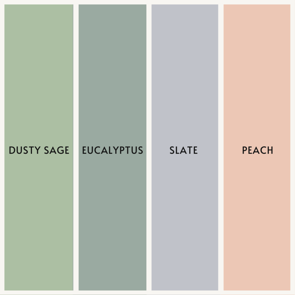
For my palette, I chose one of my favorite colors for my main color: dusty sage. Dusty hues are all the rage right now — and for good reason! This color is a great combination of boho and romantic. My second color will be a soft eucalyptus green. Eucalyptus is a deeper shade that beautifully complements dusty sage to create an organic feel.
For my neutral color, we are using a gorgeous slate grey. This color is perfect for my (soon-to-be) husband’s tuxedo! Finally, this palette will be topped off with a soft peach. This dreamy shade is a great way to add a pop of color to complement dusty sage without being overpowering.