Take a moment to look around you: what colors do you see? Since we are constantly surrounded by color, we often tune out the true beauty all around us. As a designer, I try to actively appreciate the spectrum of colors that I interact with daily. I find inspiration all around me, and I hope after reading this, you will also be inspired to look for the beauty in the colors all around you every day too!
Everyday color inspiration
For my everyday color inspiration, you need not look further than right in front of you. As a “foodie,” I love looking to food for some of my color inspiration. In particular, I am drawn to colors that have been shown to increase your appetite and make you salivate, such as reds, yellows, oranges, and golden browns. I love playing with these warm colors and incorporating them into both my graphic designs and my physical decor.
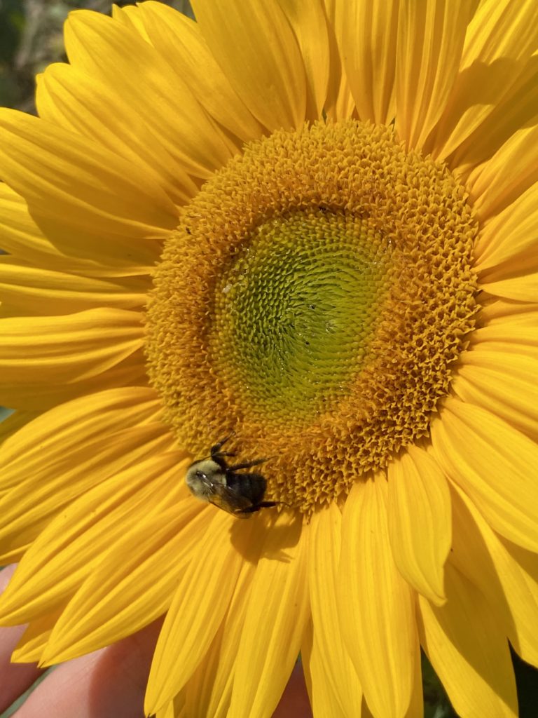
In addition, nature is one of the best places for inspiration. And, this is perhaps one of the easiest sources since it is all around us. From the blue-grey of a hazy sky, to the golden glow of dawn, to the dazzling colorful reflections of a summer sunset, all you need to do is look up to see a beautiful color scheme created by nature. For me, I love to be inspired by flowers! My favorites are sunflowers, with a beautiful combination of a sunny yellow, bright green, and deep brown. It makes for a perfect natural, summer-inspired color palette!
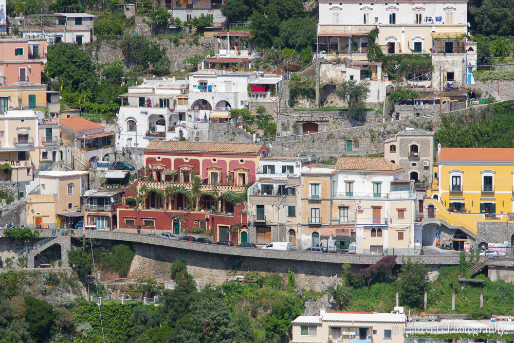
Colors that inspire my designs
It’s not uncommon for couples to come to me with a specific color palette in mind already — some brides-to-be have been planning their wedding colors for years. But more often than not, a couple will come to me with a just a piece of inspiration: their favorite color, the flowers that they want to use, or just the general “vibe” of their big day. That’s the fun part for me! I love helping people find inspiration to come up with a color palette that they love. One of my first suggestions is to find that initial piece that they want to incorporate into their colors. Like I mentioned, this can be a favorite color or flower, but it can also come from a more unique place, like having gold chairs at their reception!
I also love to play with seasonal colors. Warm tones are perfect for fall, while pastels are an ideal spring vibe. Summer calls for bright punches of color, and a winter palette is typically cool and crisp. But, I always encourage clients not to get bogged down by the “traditional” colors. While white can be great for accents, using unique colors can help showcase your own personal style. One of my favorite ways to incorporate a bit of color into an invitation is to opt for a colored envelope over the classic white style.
Metallics are another great way to fill out a wedding palette! All types of metallics are trending right now, from classic gold to rose gold to silver, as well as matte metallics and more. A metallic accent can elevate your color palette and make your event feel even more elegant and luxurious.
So, how do you pick a color palette?
My recommendation for picking a color palette is to focus on four colors: this is ideal to provide flexibility in your color choices while preventing you from becoming overwhelmed by superfluous options. First, pick your favorite/primary color that you want highlighted. Next, choose a complementary shade opposite your main color on the color wheel. Then, pick a neutral color as an accent. Don’t forget, neutral doesn’t mean boring! Neutrals can be earthy and rich, and this hue can help define your style. Finally, you can complete this palette with a second neutral or a metallic accent.
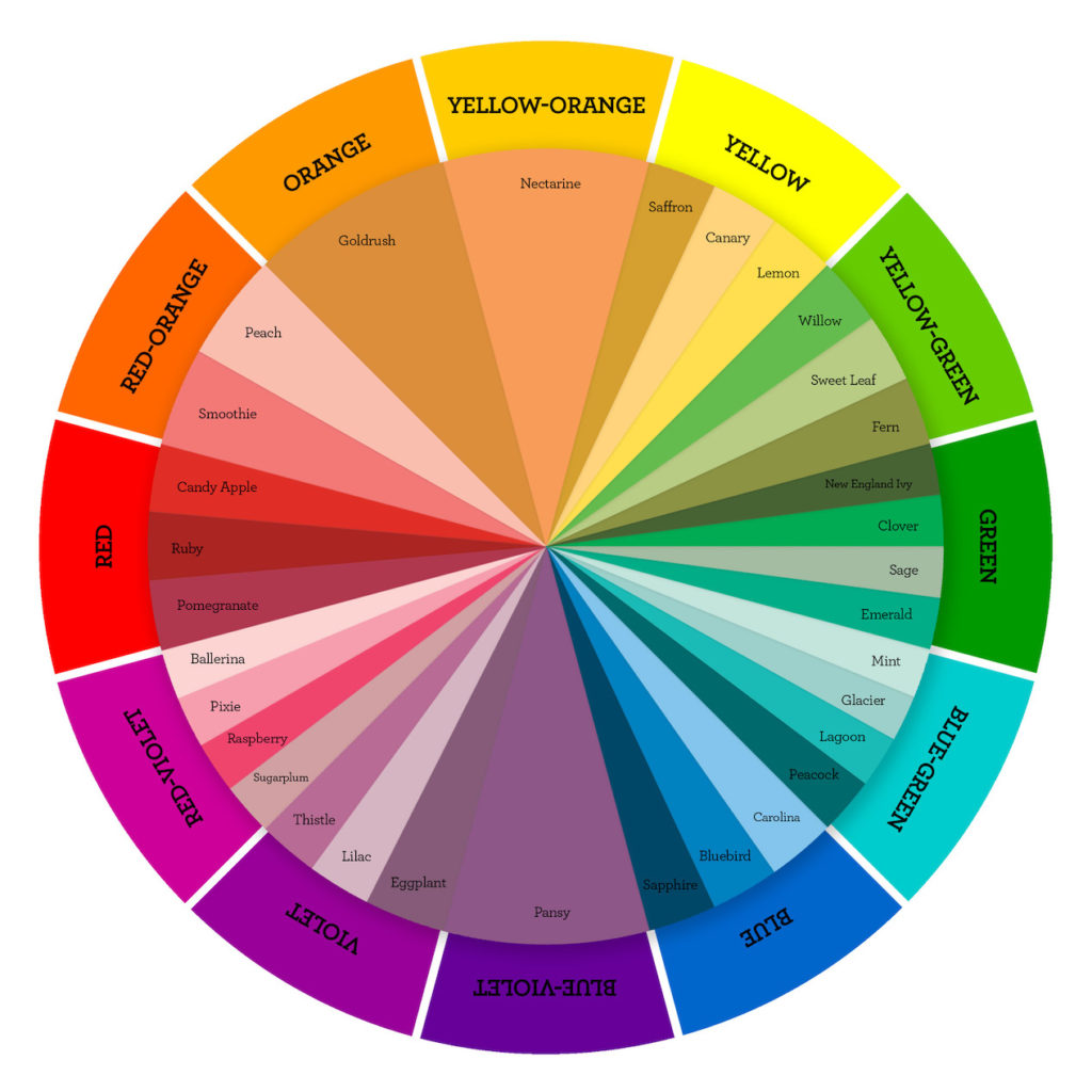
The color palette of any large event is going to be important for lots of different aspects: your invitations, decorations, and even your make-up and outfits! Luckily, there is inspiration all around you! Remember to stay true to yourself and find colors that match your personal style!
If you can’t decide what color palette to choose, Custom Creations Boutique is here to help. We love mixing the perfect palette that will inspire your entire day. You can book your color palette design here.
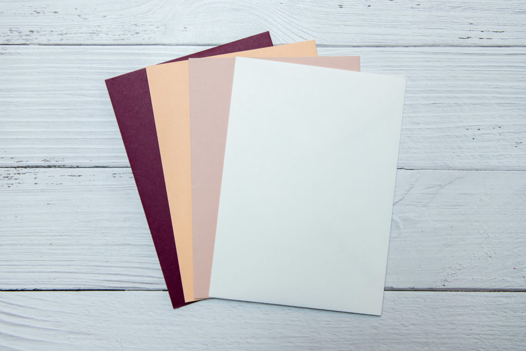
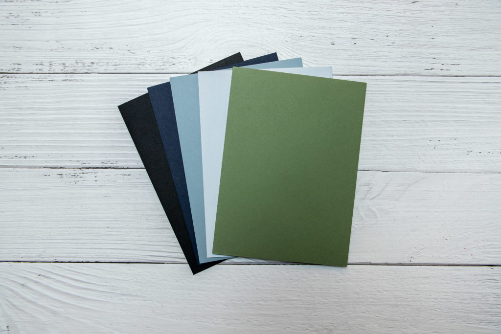
[…] of my favorite things about winter is the dark, moody color palettes. Now, don’t get me wrong — I always love a bright and sunny color combination as well. […]